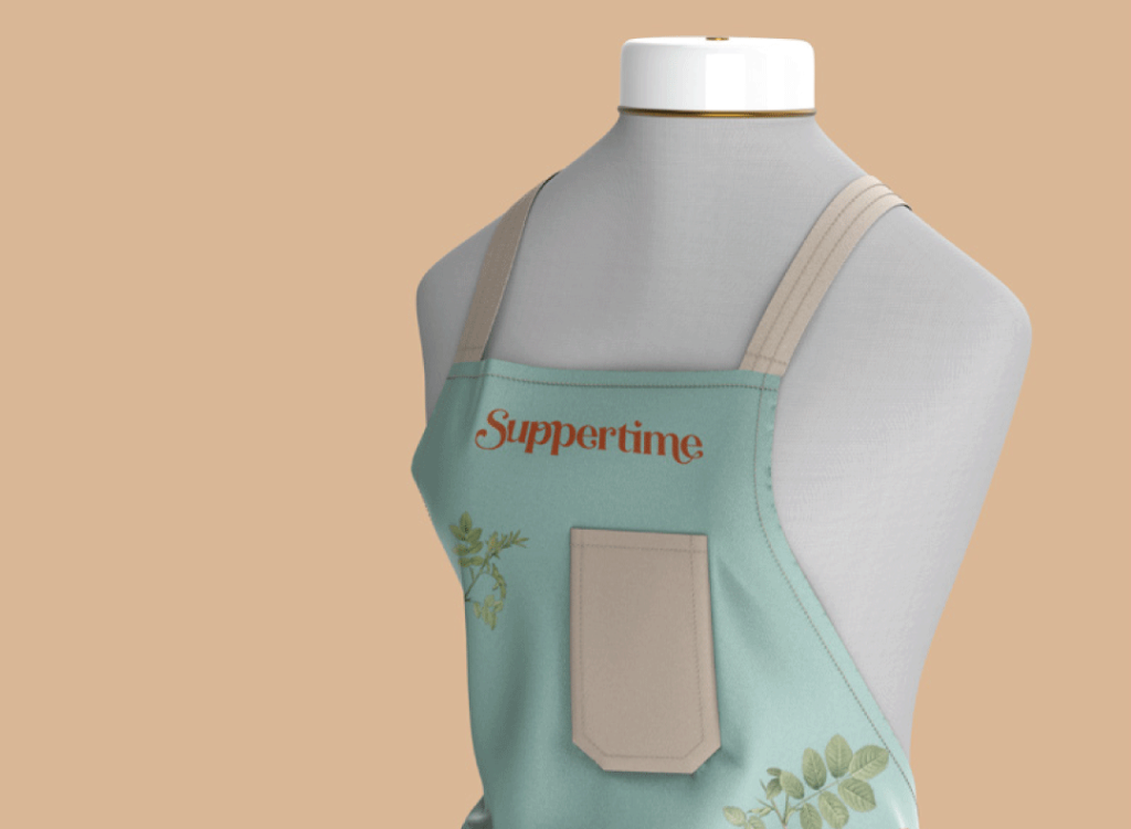
Suppertime

Logo & Brand
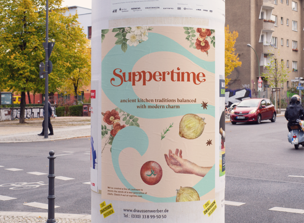
Suppertime is a cookware brand that calls back to eras such as Victorian England and colonial America in its brand identity in order to evoke the old-fashioned sense of enjoyment and community that comes with cooking. The logo, for instance, is made up of interconnecting letters and a pie-slice dot on the “i” to represent how food brings people together. Aimed at young adult consumers ages 18-35, the brand blends modern visual motifs with Victorian-inspired typography and elements of “cottage-core,” a trending social media movement popular with younger audiences.
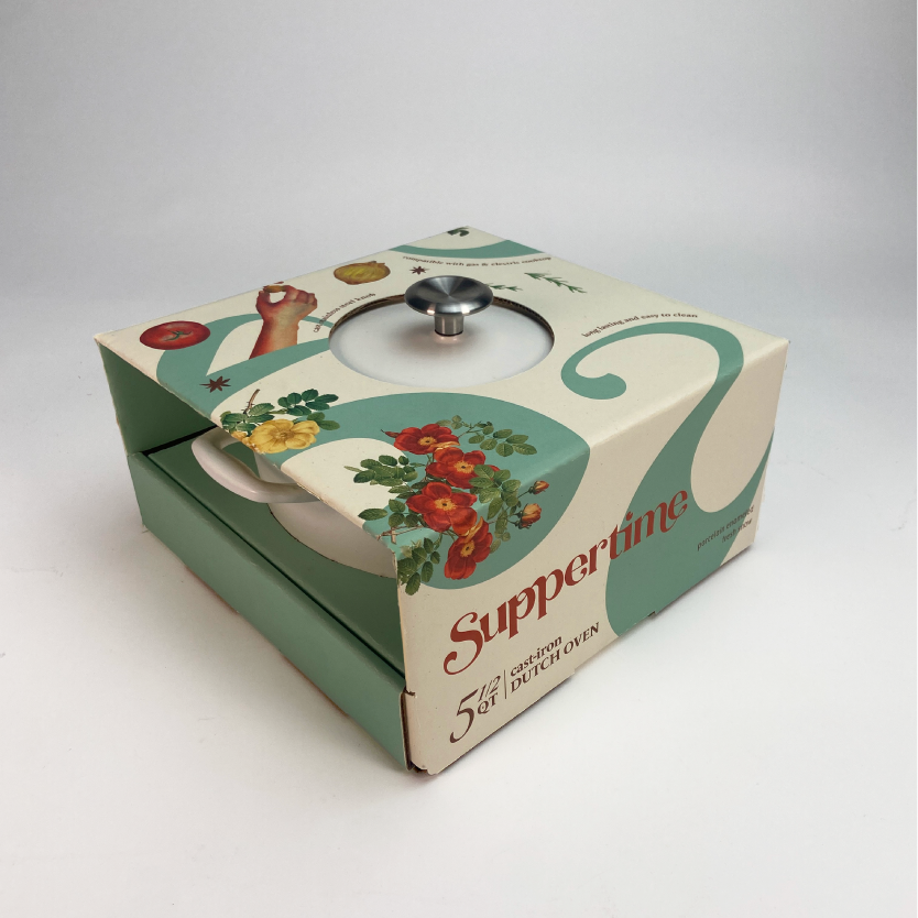
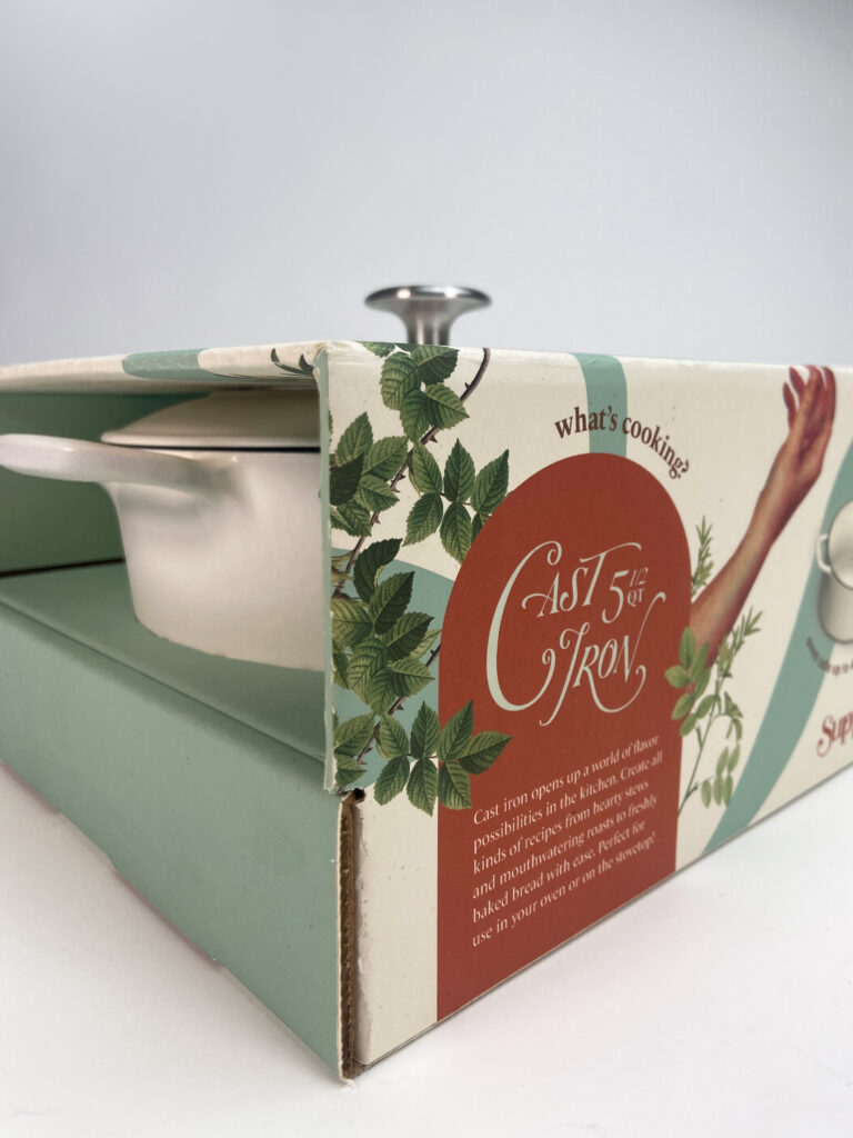
Dutch Oven Packaging
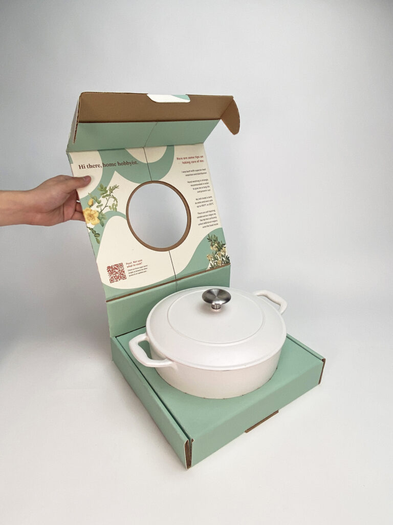
Studies show that online shopping is most highly enjoyed among members of Gen-Z, and that 29% of Gen-Z finds products through social media. That’s why Suppertime’s dutch-oven packaging takes inspiration from direct-shipping products. Opening the direct shipping box immediately reveals the exposed lid and knob, and the handles poke out of the sides for easy removal.

Illustrations


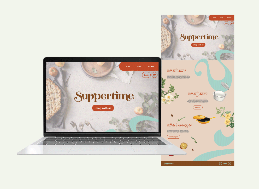
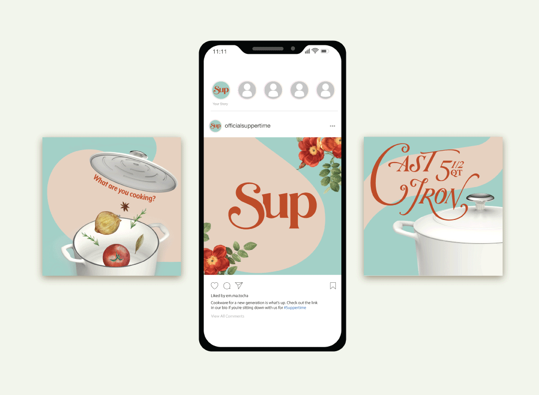
Web & Social Media
Merchandise
